Project Description
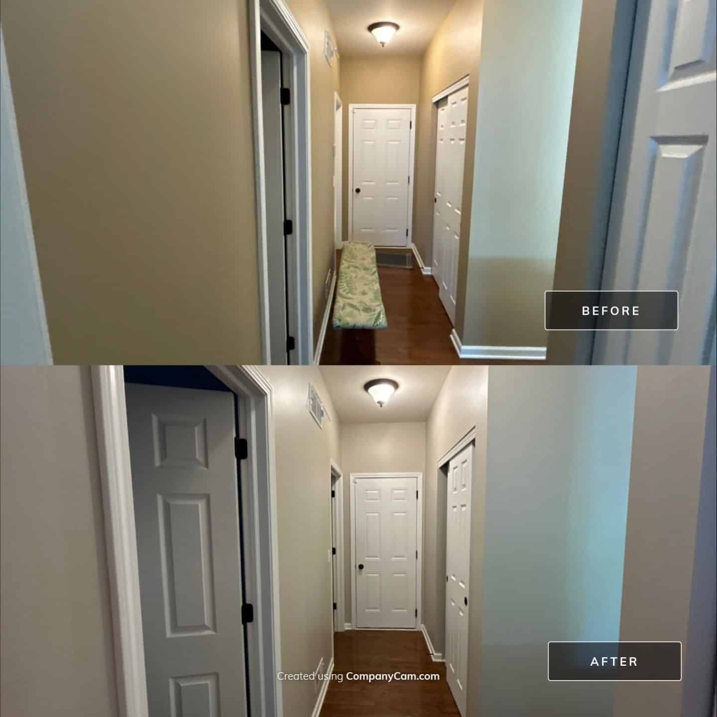
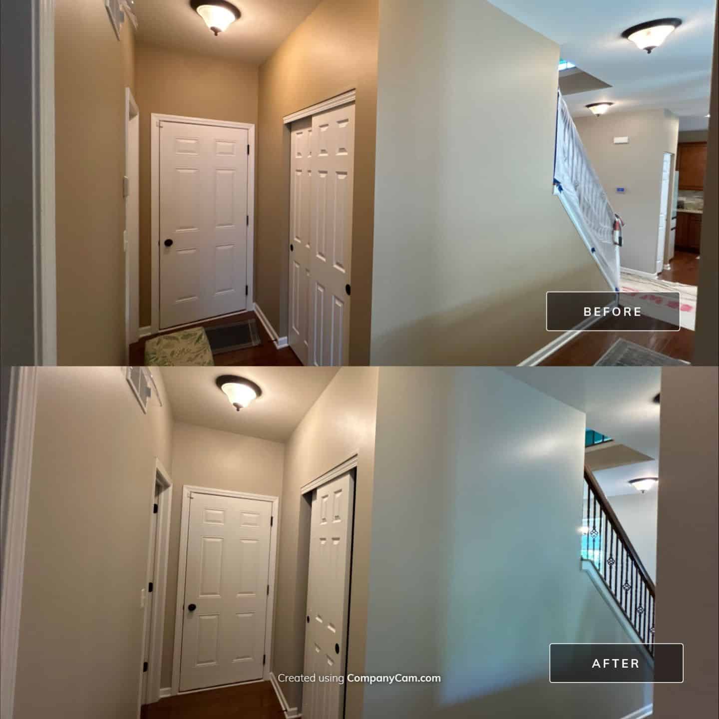
This five-day residential project in Shorewood, IL, was a comprehensive interior repaint that covered nearly every major living space in the home. The homeowner hired Powers Painting & Decorating to give their home a fresh start with new color palettes and clean, modern finishes. From ceiling-only spaces like the foyer, stairway, and upstairs hallway to full wall and ceiling treatments in kitchens, bedrooms, family spaces, and halls, our crew tackled it all with precision and care.
The home sits in a quiet subdivision and features a variety of architectural transitions—vaulted ceilings, open stairwells, and cozy tucked-away rooms. The scale of the project required thoughtful scheduling and strong attention to detail to ensure clean lines, seamless color transitions, and minimal disruption to the family living in the home during the process. While each home and price point is different, this was a multi-room, whole-house interior repaint tailored for a busy household looking for both quality and a smooth experience.
Background/Story:
This homeowner was ready for a change. After years of living with builder-grade finishes and neutral tones, the family felt it was finally time to inject some personality into their space. Their biggest concerns were outdated colors, inconsistent paint quality, and general wear-and-tear—especially on high-traffic surfaces like the kitchen and hallways. The ceilings in areas like the foyer and stairwell had also yellowed over time, making the home feel a bit darker and more dated than they preferred.
They found Powers Painting & Decorating after researching local painters with strong reputations for clean work and great color consultation. From the first walkthrough, our focus was listening: understanding how they used each room, which spaces mattered most, and how color could support the way they lived.
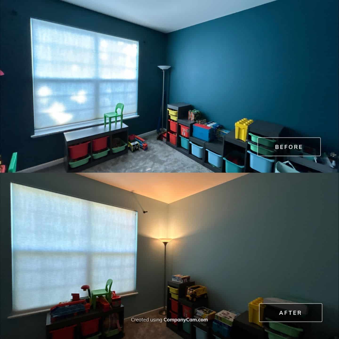
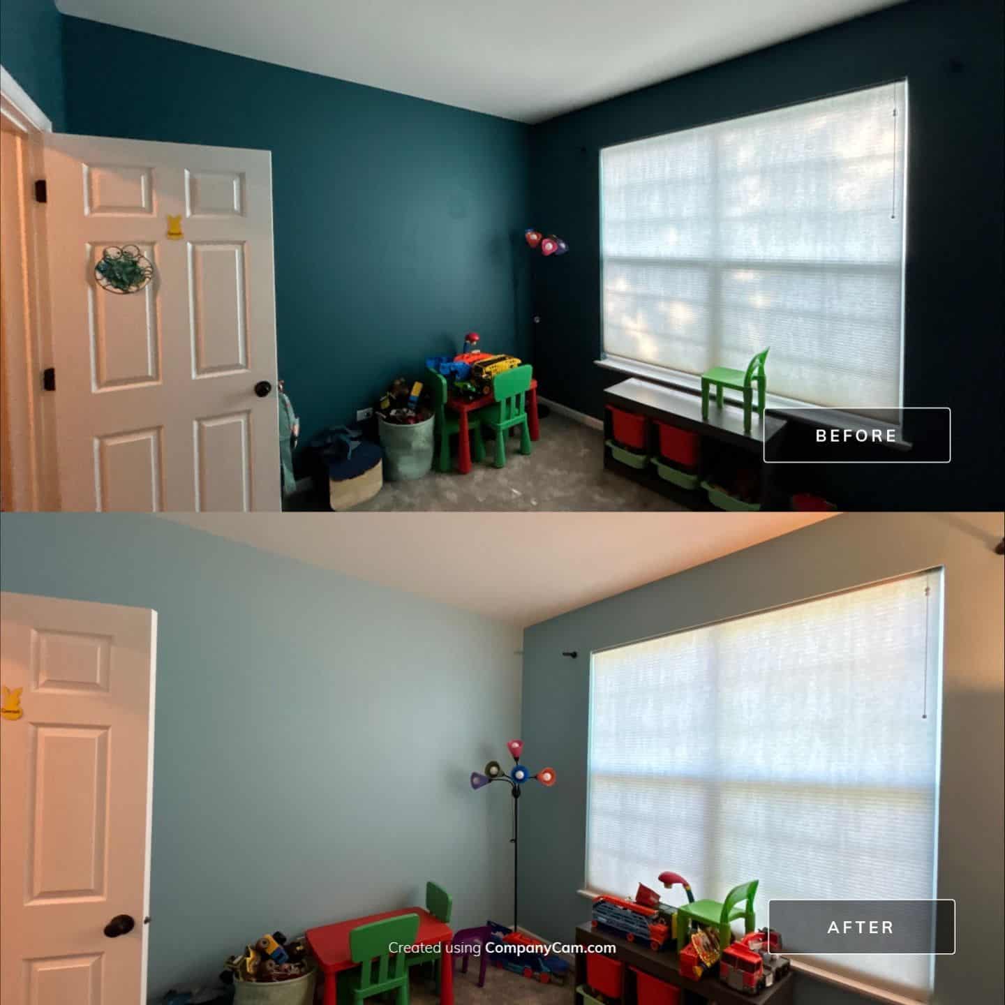
They weren’t looking for anything too flashy—but they did want color with character. Soft earth tones for main areas, a few bold choices in bedrooms and play areas, and modern finishes that would reflect light and make the home feel larger, cleaner, and more welcoming.
Throughout the five-day process, we worked room by room, keeping things organized and keeping communication open. Whether it was prepping ceilings in the two-story stairway or painting the playroom a cheerful, inviting green, every task was completed with care and attention.
Scope of Services
Sherwin-Williams Emerald Designer Eggshell – B003 PPU5-8 Sculptor Clay: Used as the main neutral color in several common areas, this soft, earthy tone grounded the home in warmth and complemented the home’s natural light.
Sherwin-Williams Emerald Designer Eggshell – SW6800 Something Blue: Applied in a bedroom for a calm, refreshing aesthetic with a subtle contemporary edge.
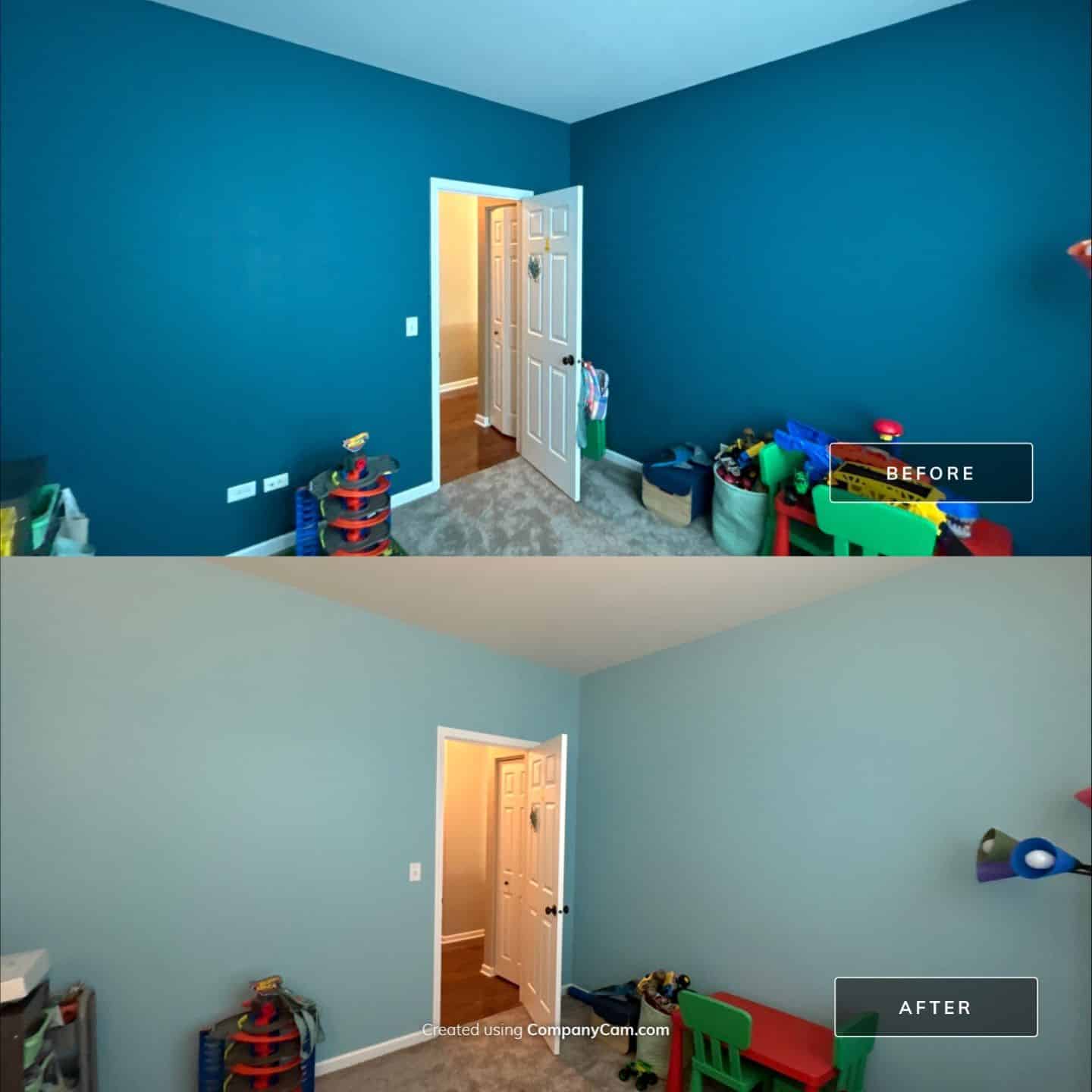
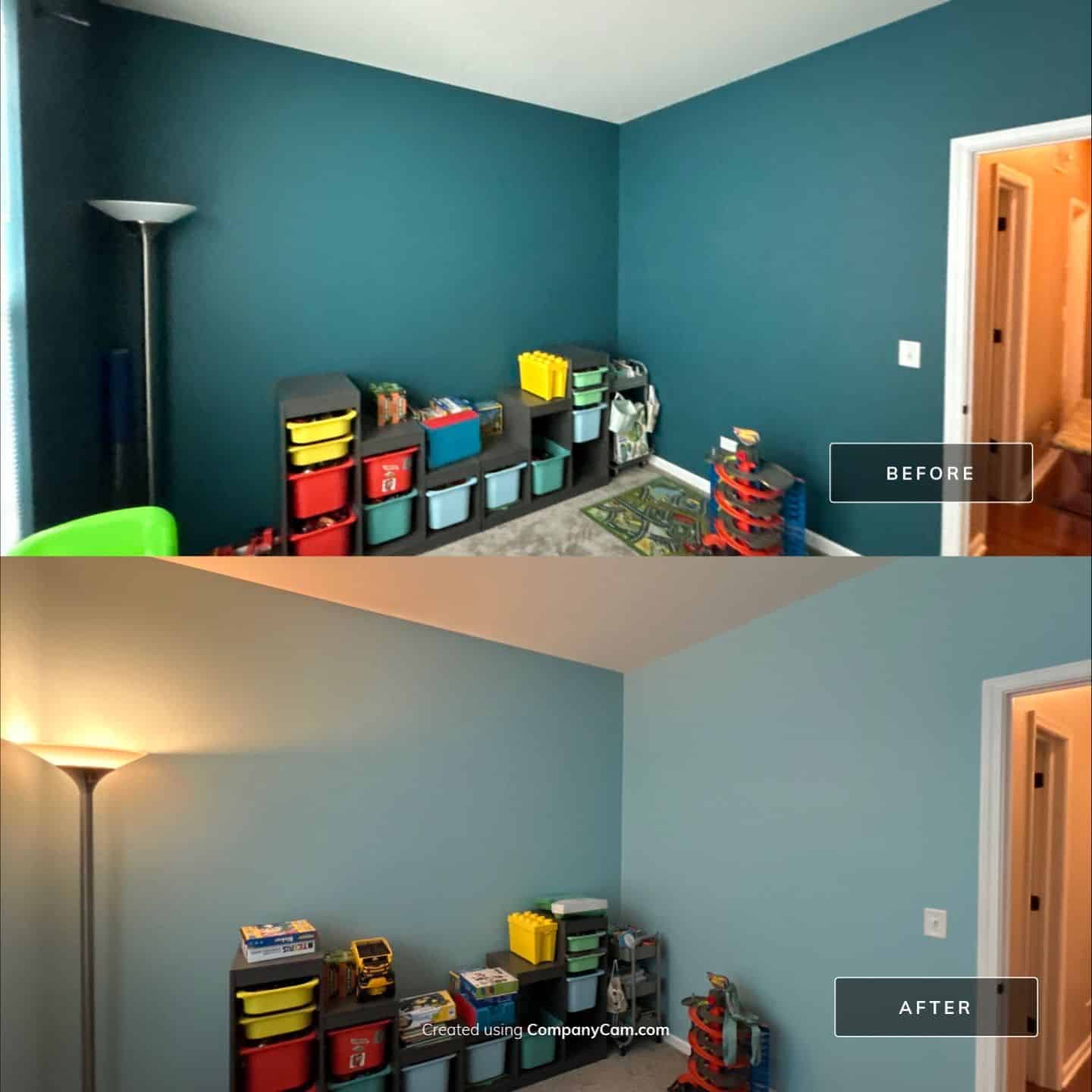
Sherwin-Williams Emerald Designer Eggshell – SW6928 Green Vibes: Featured in the playroom to add fun and vibrancy; its cheerful tone made the space more engaging and family-friendly.
Sherwin-Williams Emerald Designer Eggshell – SW9053 Agua Fria: Used as an accent in transitional spaces for a crisp, cool tone that balanced other warmer hues.
Sherwin-Williams Emerald Designer Eggshell – SW6450 Easy Green: Selected for a quiet room like the office or laundry area, providing a soft green that calms and refreshes without overpowering.
Paints/Products Used
Sherwin-Williams Emerald® Designer Edition™: Premium interior paint selected for its luxurious finish, high hide, and long-term durability.
-
SW7068 Grizzle Gray – used for the feature accent wall in the basement
-
SW9163 Tin Lizzie – applied in main basement living areas
-
SW7064 Passive – chosen for a balanced, subtle tone in bedrooms and bathrooms
Custom Color Match: Valspar Quiet Interlude V005 8005-4A – matched for a calming contrast in select spaces.
Flat Black Ceiling Paint: Used in the back room for a bold, moody ceiling finish with a modern edge.
Professional-Grade Primer: Applied where needed to ensure excellent paint adhesion, consistent coverage, and long-lasting results.
Results:
At the end of the five-day project, the home felt completely refreshed—lighter, cleaner, and full of life. The ceiling repaints made a huge difference in how open and bright each room felt, especially in the foyer and stairway. The walls, now dressed in coordinated designer colors, finally gave each room its own identity without sacrificing cohesion.
The bold greens and blues in the bedrooms and playroom brought joy and personality, while the neutral tones in common areas created a comfortable, inviting flow throughout the home. The finish on every surface was crisp and consistent. Edges were sharp, transitions were smooth, and there wasn’t a single drop out of place.
The homeowner’s reaction? They were thrilled. From start to finish, they appreciated the organization, communication, and attention to detail. They commented that the whole house felt like new, and that the colors truly reflected their style and energy. And for us at Powers Painting & Decorating, that’s always the most rewarding part—seeing a home come to life through thoughtful color and quality craftsmanship.


")